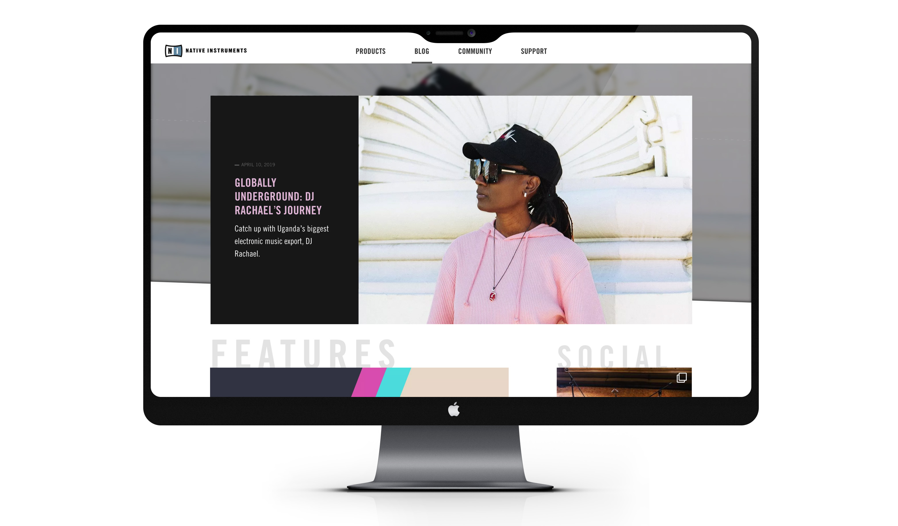
Native Instruments
Native Instruments is an industry-leader in software and hardware for computer-based audio production and DJing. I worked in their digital team to work on various user experience challenges and redesigns for their main website, native-instruments.com. The most prominent challenges I worked on were:
☼ Redesign support website
☼ Redesign global checkout page
☼ Lead UX on launch of blog platform
☼ Research critical UX problems
☼ Create product vision and roadmap
Keywords: digital design, strategic vision, music, ecommerce
My role
✺ Redesign UX trajectory for checkout and support pages
✺ UX research + key pain points product finder
✺ Stakeholder interviews
✺ Translate interviews and field research into personas
✺ Information architecture
✺ Define product goals
✺ Define main user journeys
✺ Define vision + roadmap for 2 quarters
✺ Define UX values
✺ Translate goals, journeys into user-facing epics
Key impact
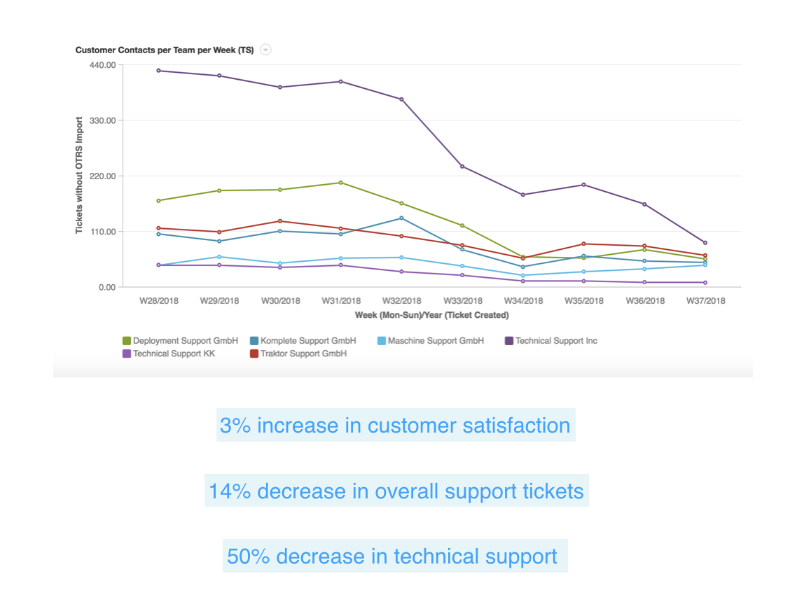
⇢ Redesigned support page:
⇢ 3% increase in customer satisfaction
⇢ 14% decrease in overall support tickets
⇢ 50% decrease in technical support tickets
⇢ Redesigned check-out page
⇢ 30% decrease in time cart to checkout
⇢ 4% increase in conversion
Support page redesign
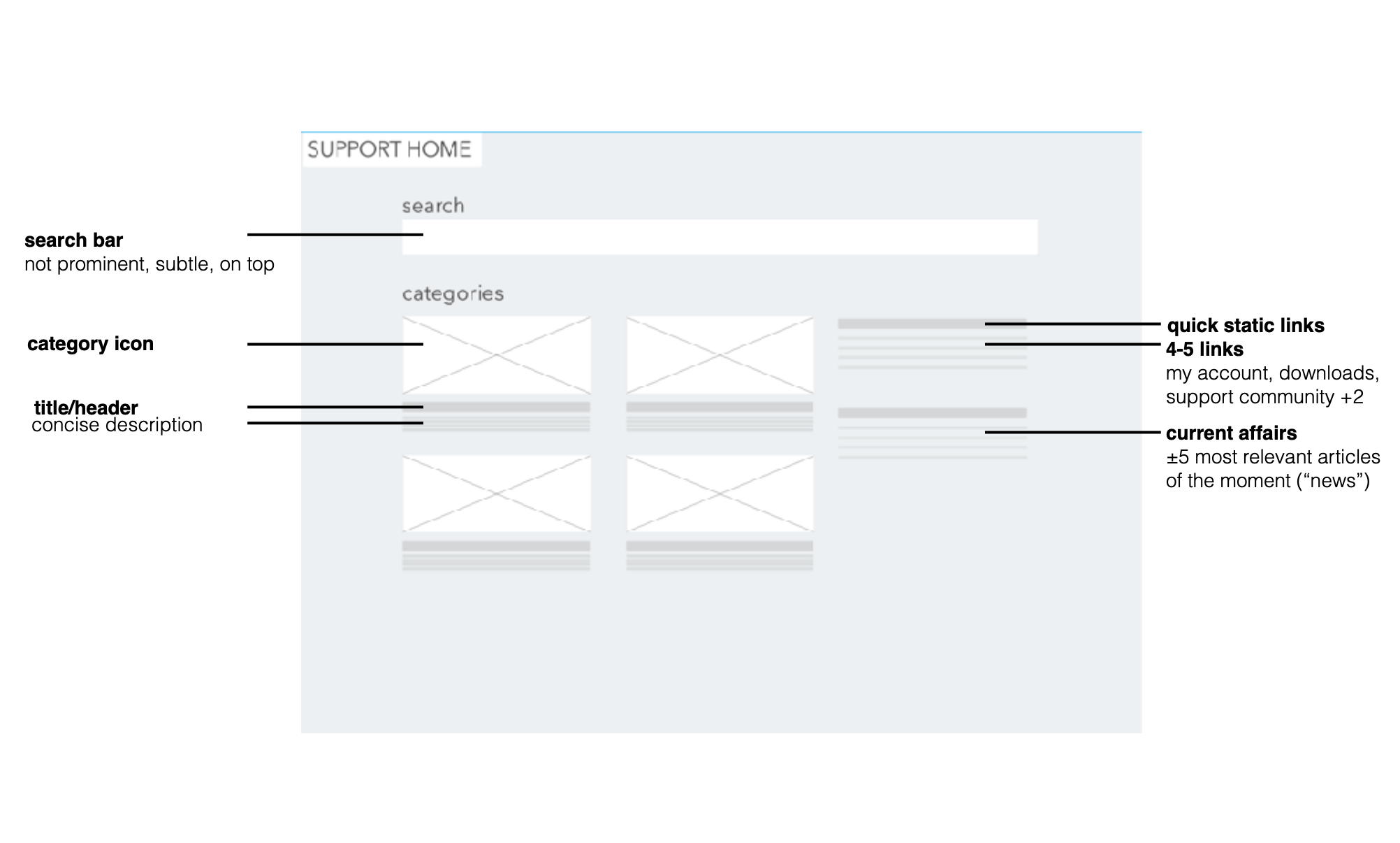
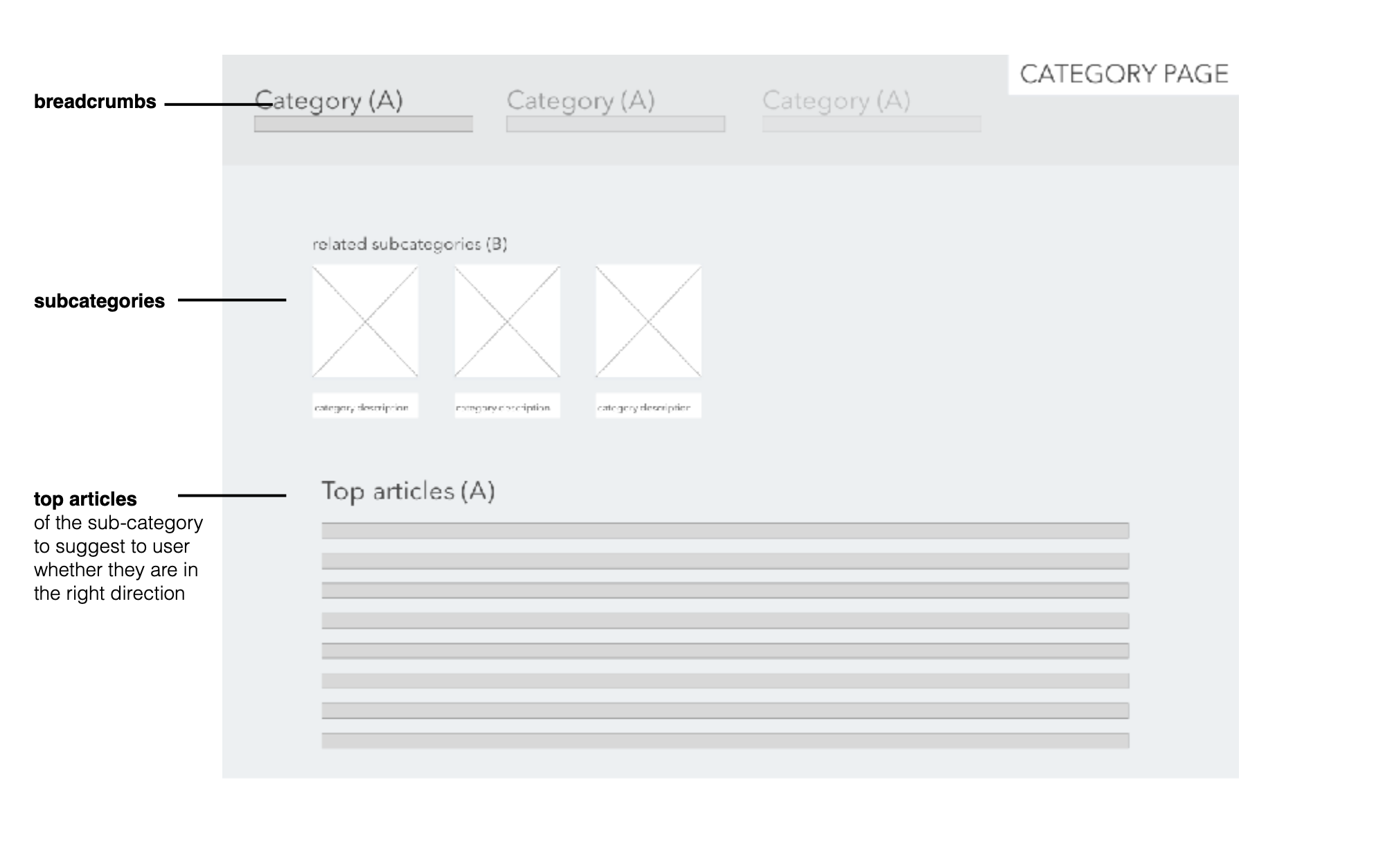
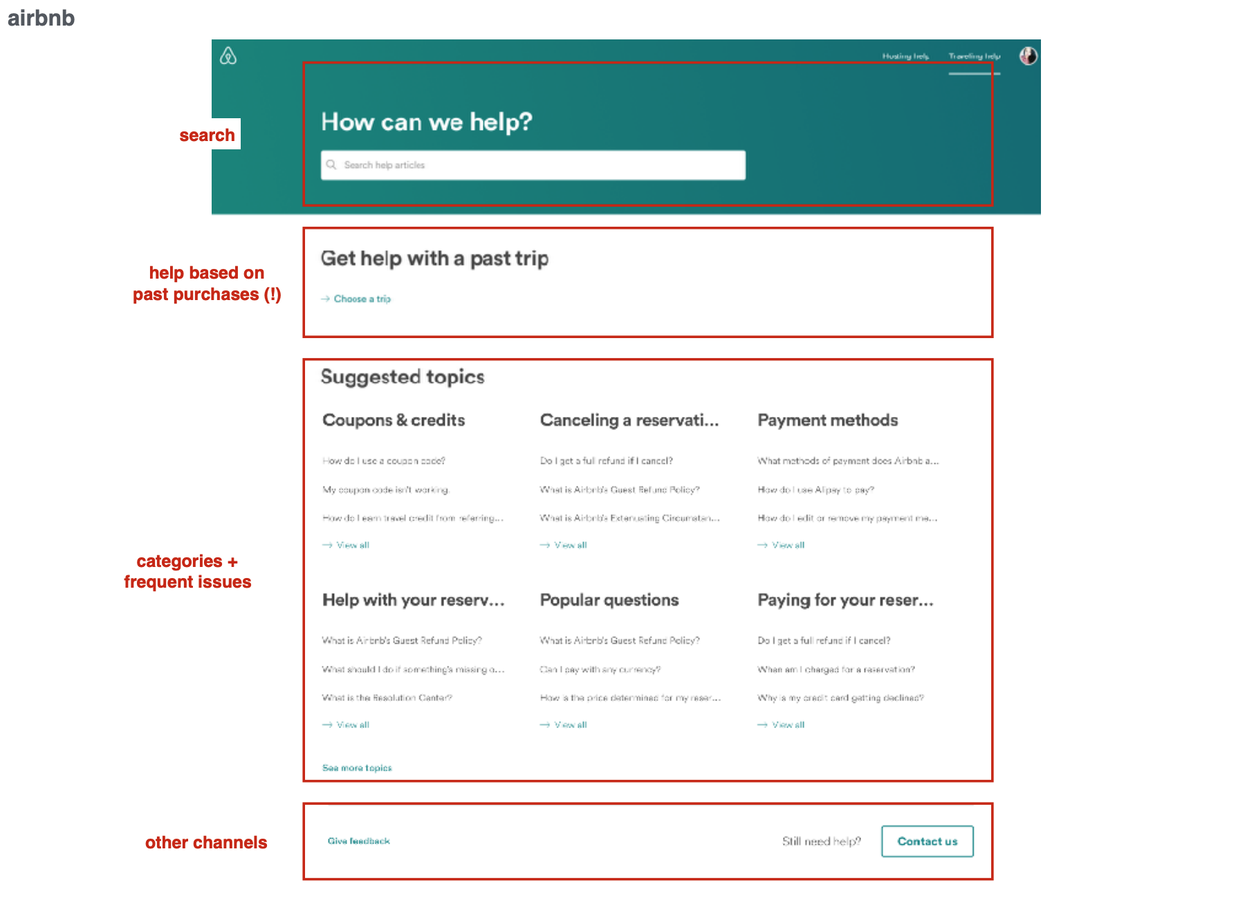
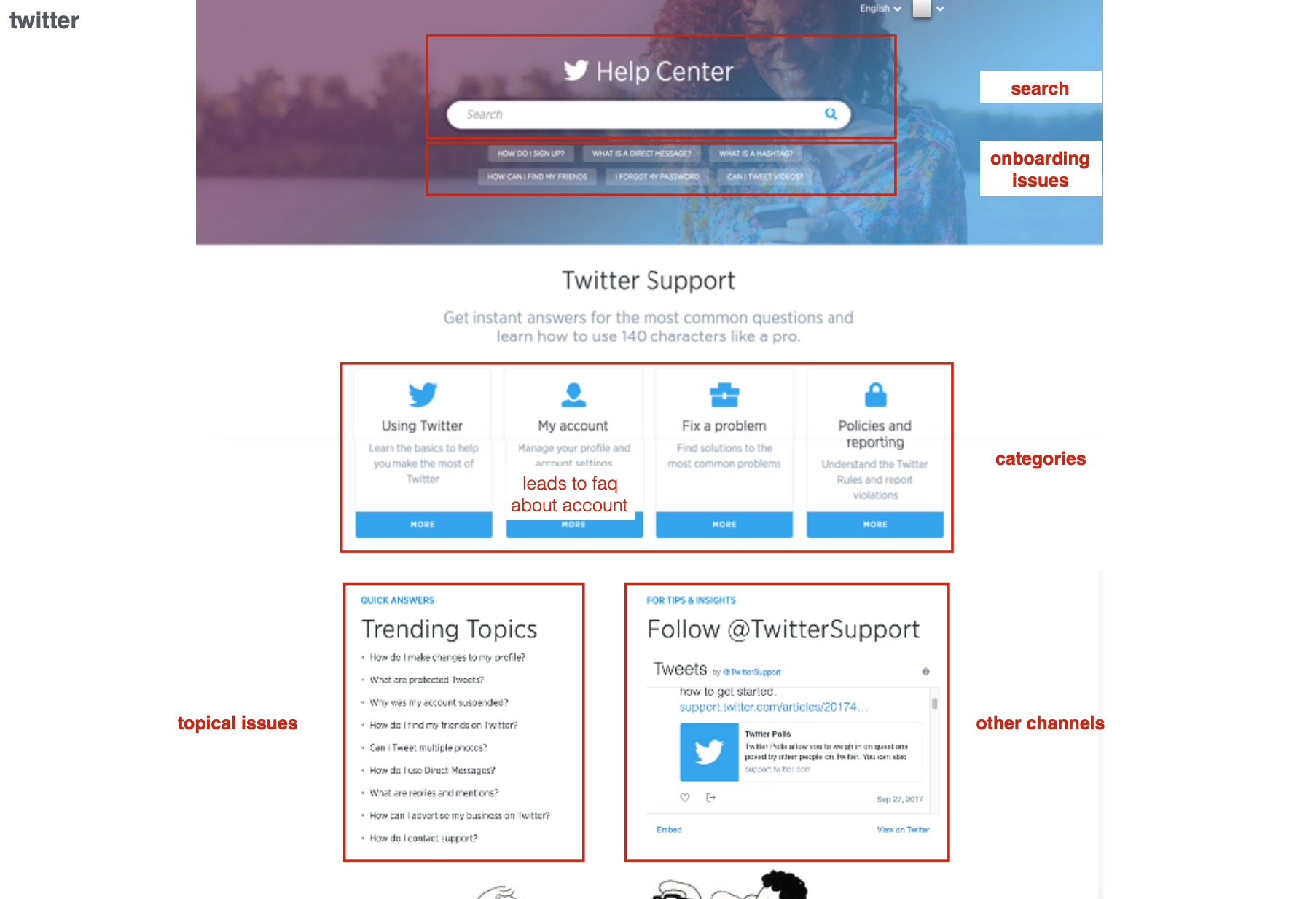
Support redesign process
In redesigning the support page, a variety of stakeholders were involved - the support team leaders, front-end developers, Zendesk developers and UX (myself). The collaborative process roughly took place as follows:
❅ Deep dive research: interviews with support staff, competitor analysis, Zendesk research
❅ Problem redefinition
❅ First rough wireframing
❅ Internal user testing
❅ Analyze testing results -> Design iteration
❅ Clickable mockup
❅ External user testing
❅ Final design
Key learnings support redesign
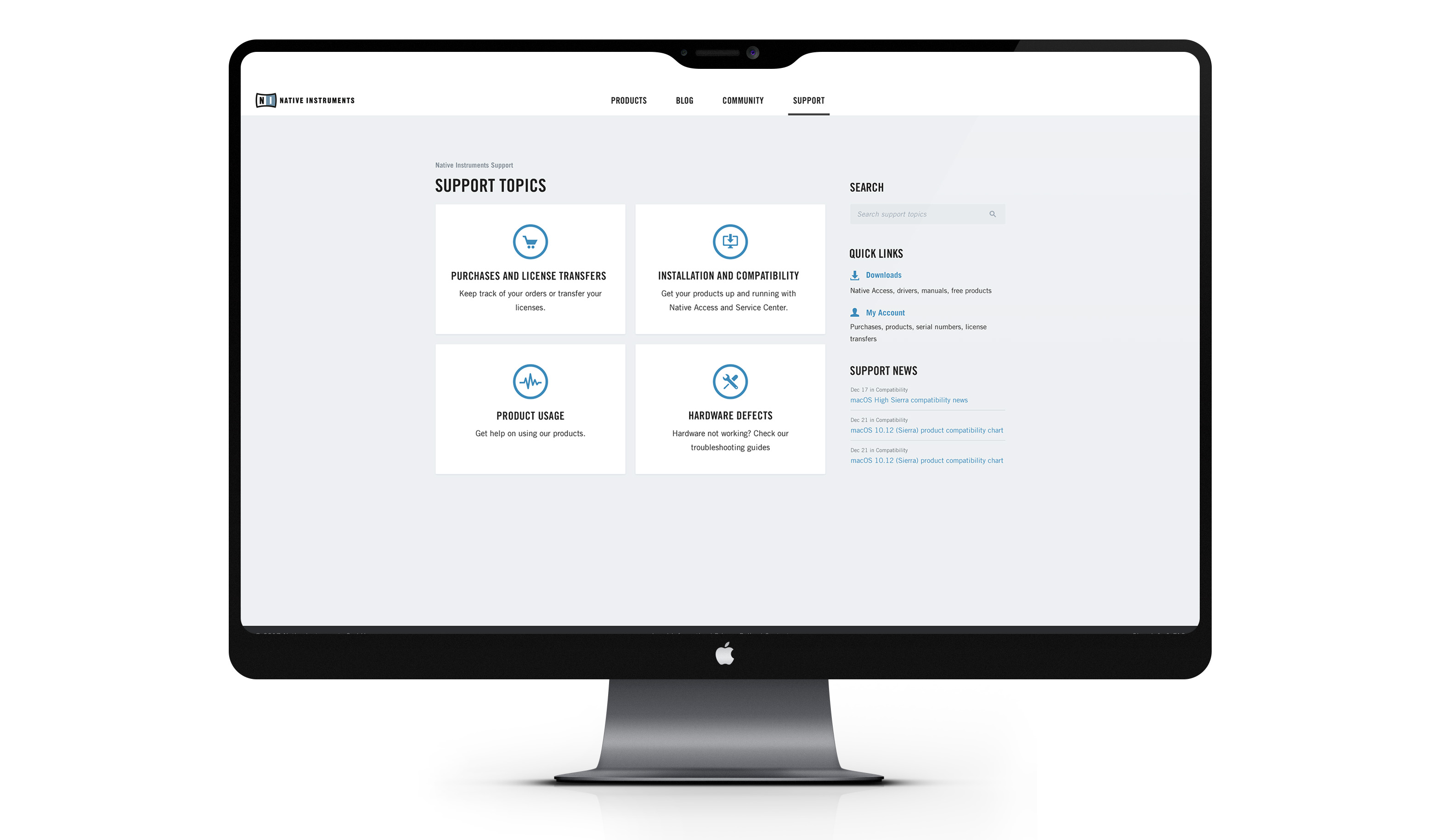
One of the main key learnings during user research was that a majority of support tickets revolved around two main themes: accessing their downloads post-purchase and making changes to their account. It was clear that simply increasing the accessiblity of these features would possibly reduce a large number of manual support that our support staff had to offer.
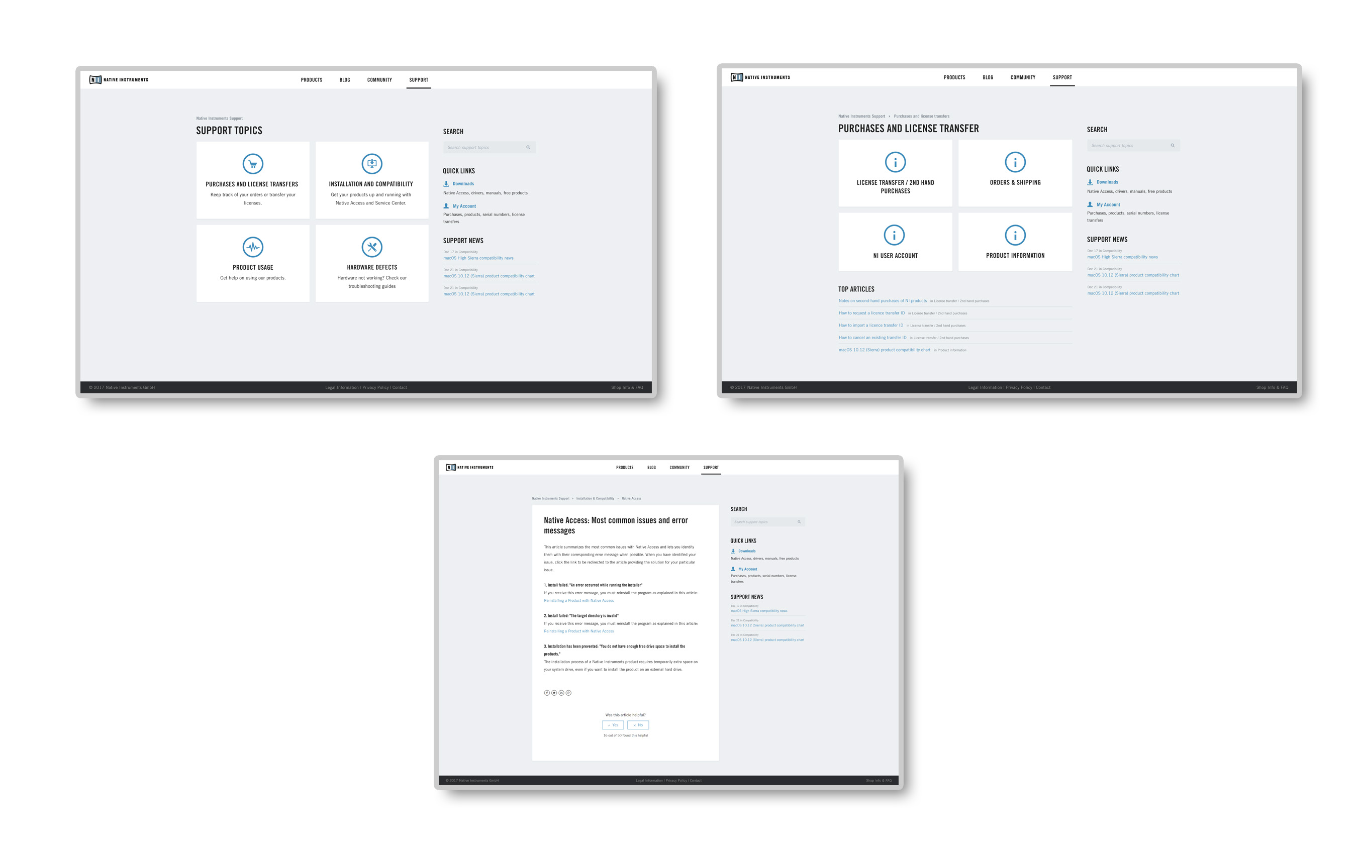
We concluded that our redesign mainly had to revolve around:
✦ Accessing My Account and Downloads
✦ A more accessible categorisation system
✦ More visual hierarchy in the page that matches categorisation
✦ More visual language to simplify recognizing users' problem area
Limitations
✧ Design and development limitations of Zendesk
✧ Limited resources/time to implement
Checkout redesign
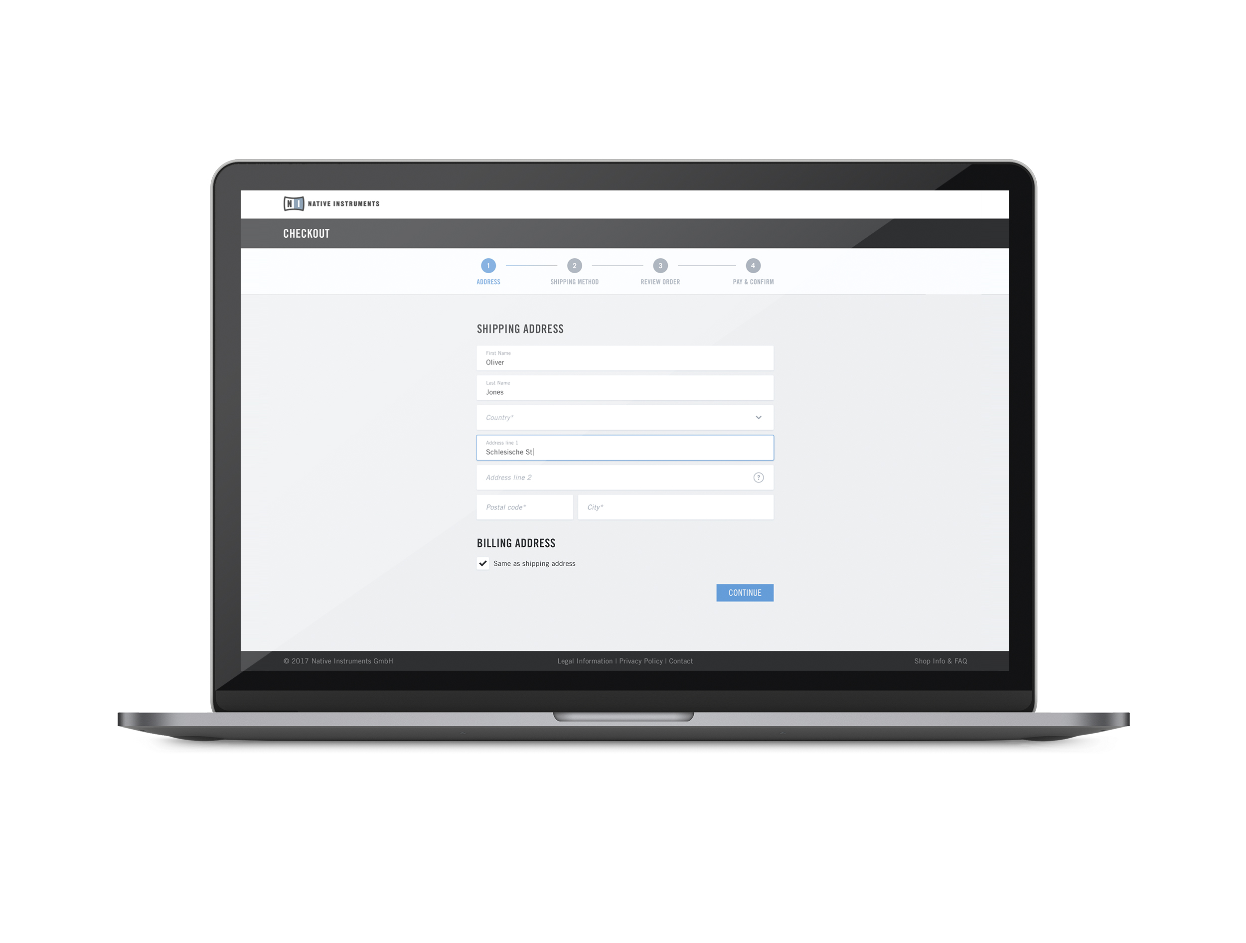
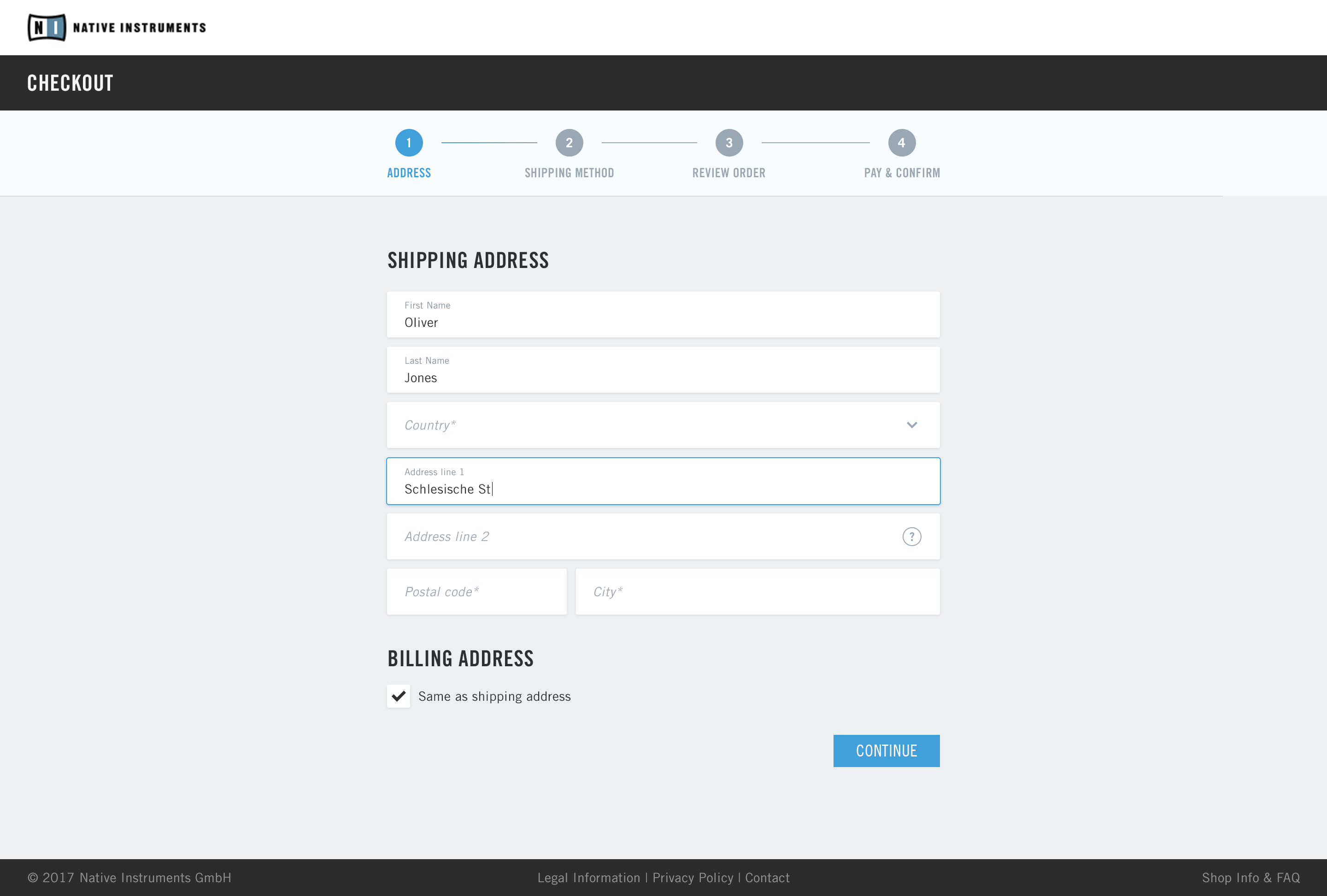
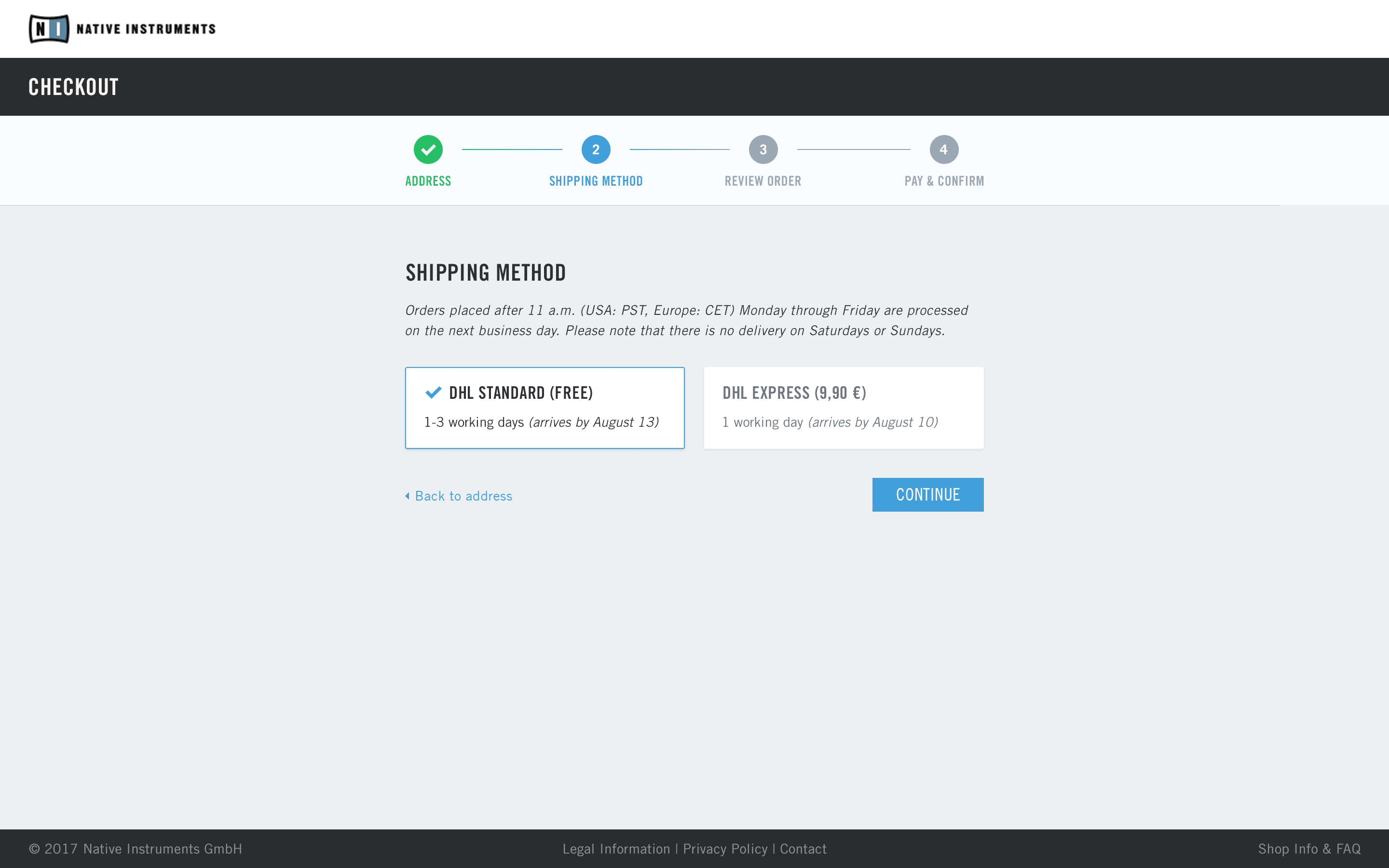
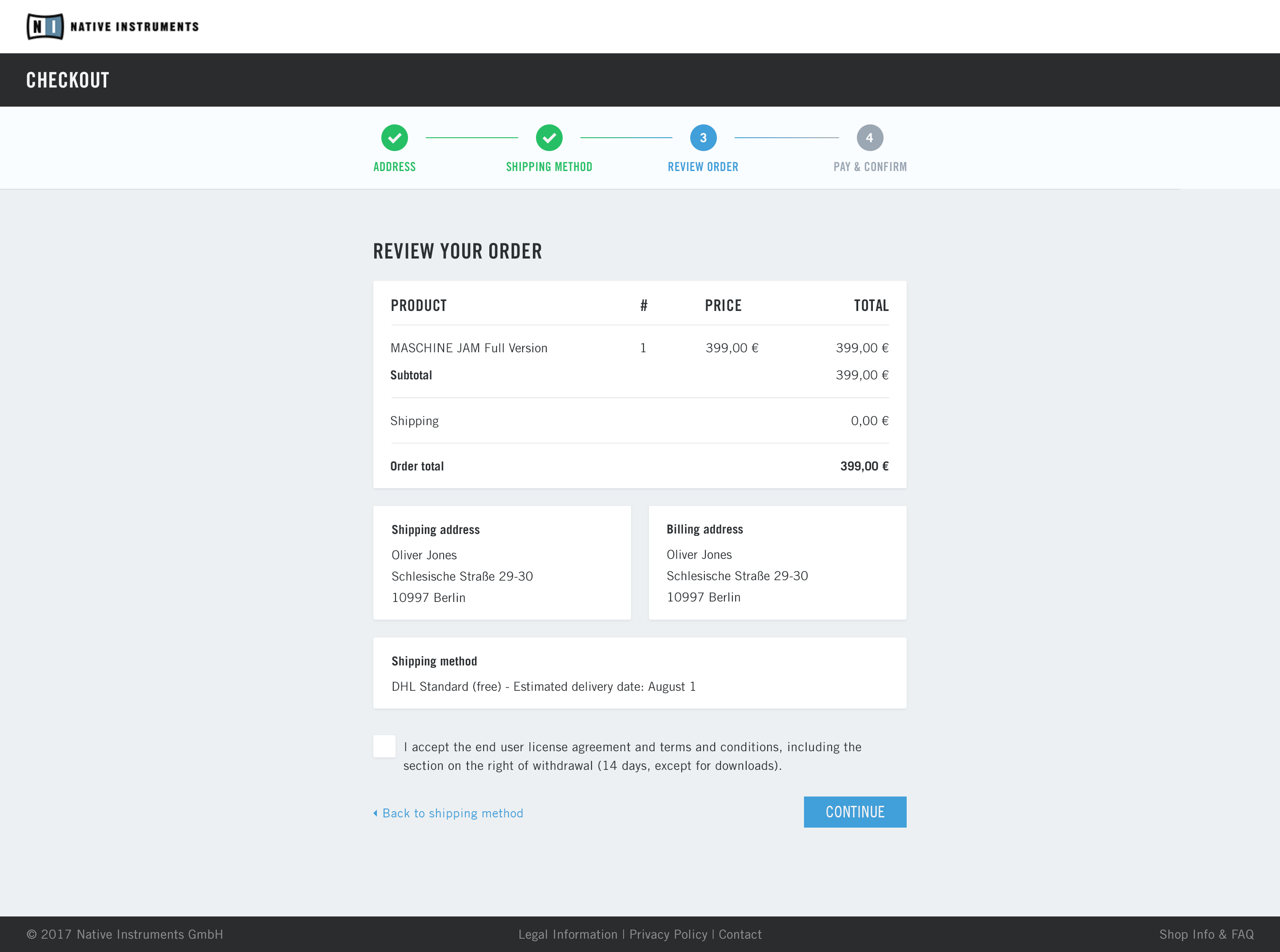
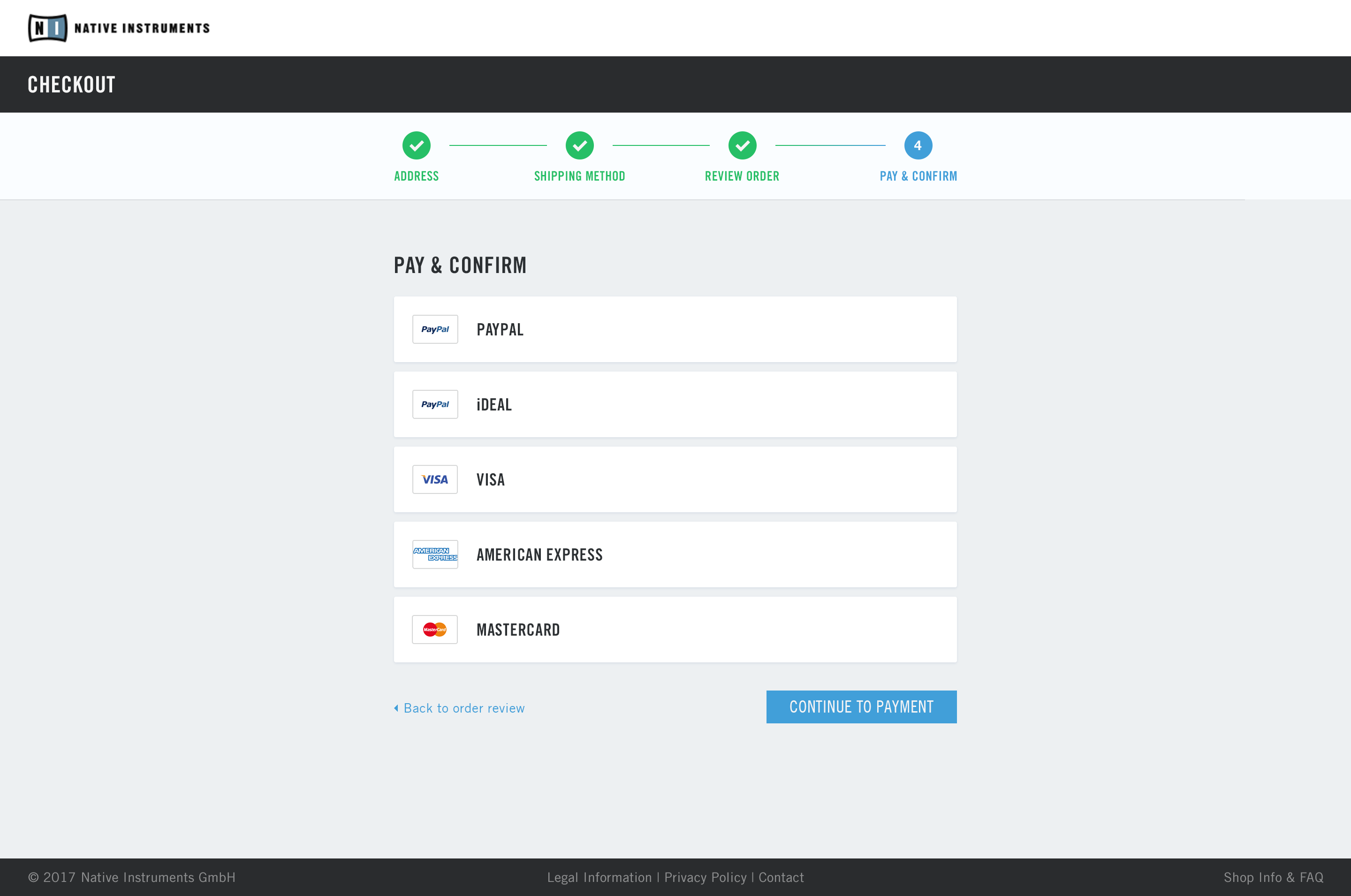
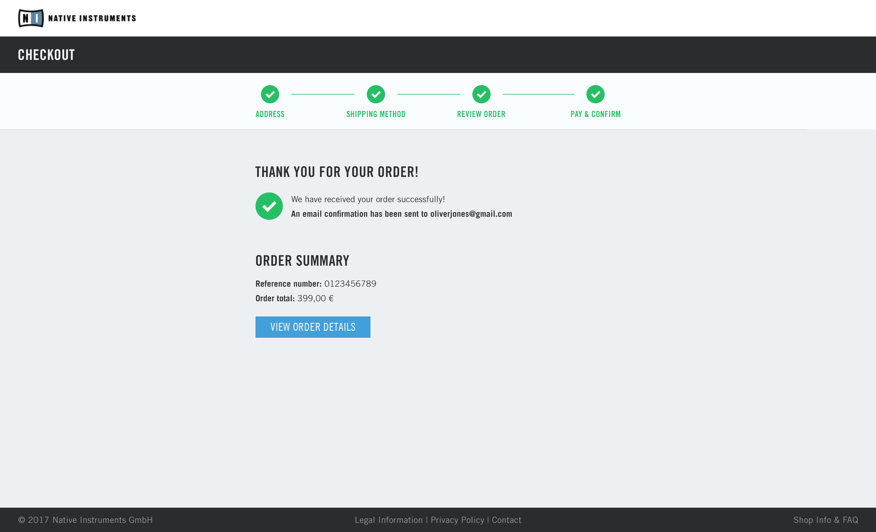
In 2017, it was identified that the checkout page needed an overhaul. I led the UX trajectory doing analysis, prototyping and collaborating with the UI designer and front-end developer to make the new concept come to fruition. Our conversion rate increased by 4% and one of the main usability wins was decreasing the check-out time by 30%. Other engagement metrics are being tracked with the Google HEART framework. The process and outcome has been outlined below.
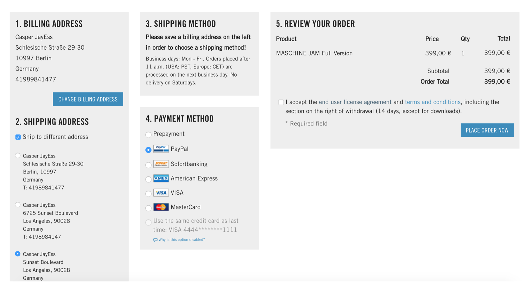
Old checkout page
Process & analysis
The entire process from UXR, prototyping, iterating to implementation took about five 2-week sprints.
Current situation analysis
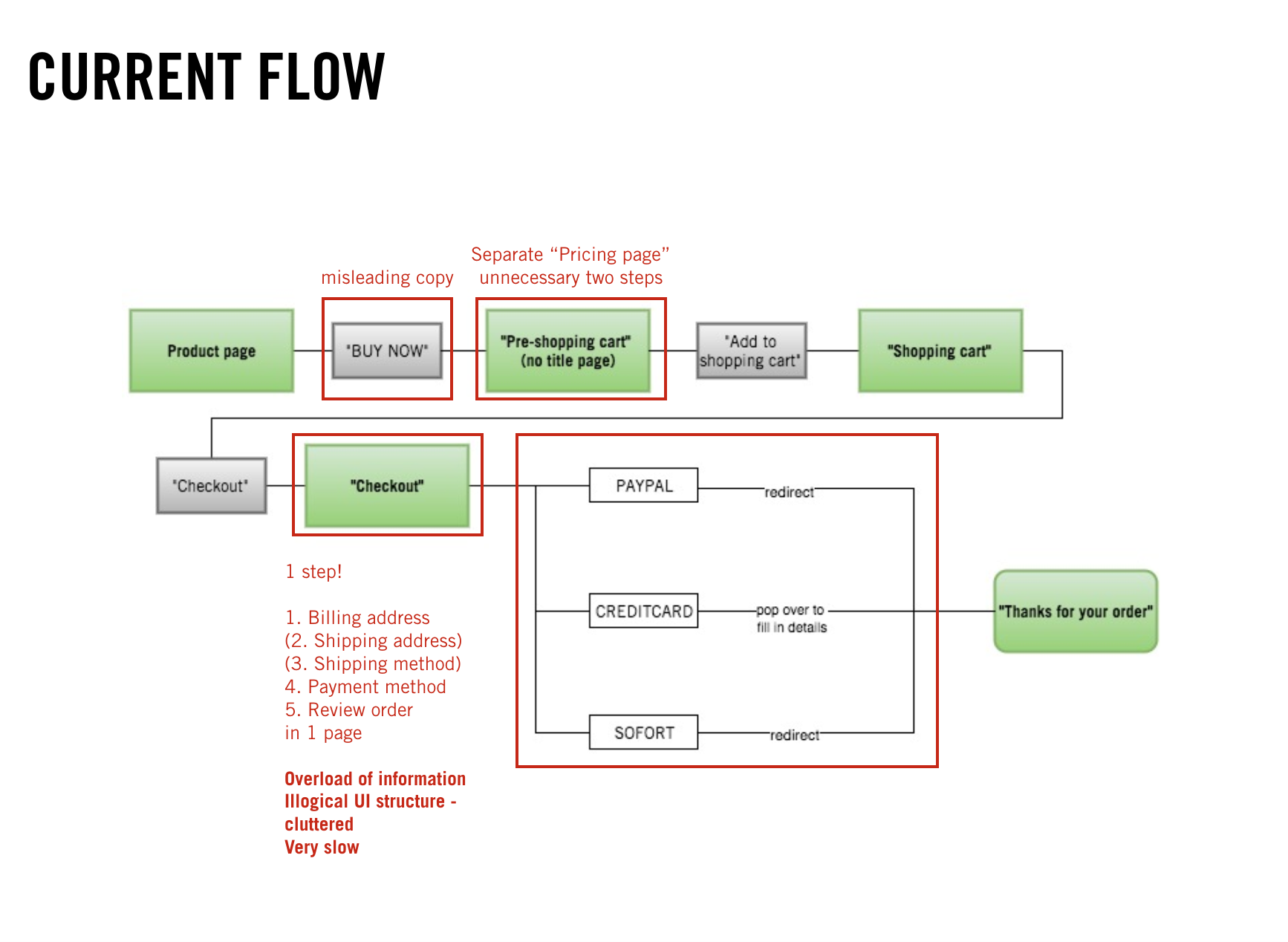
Analysis screen flow
Mapping out user flow
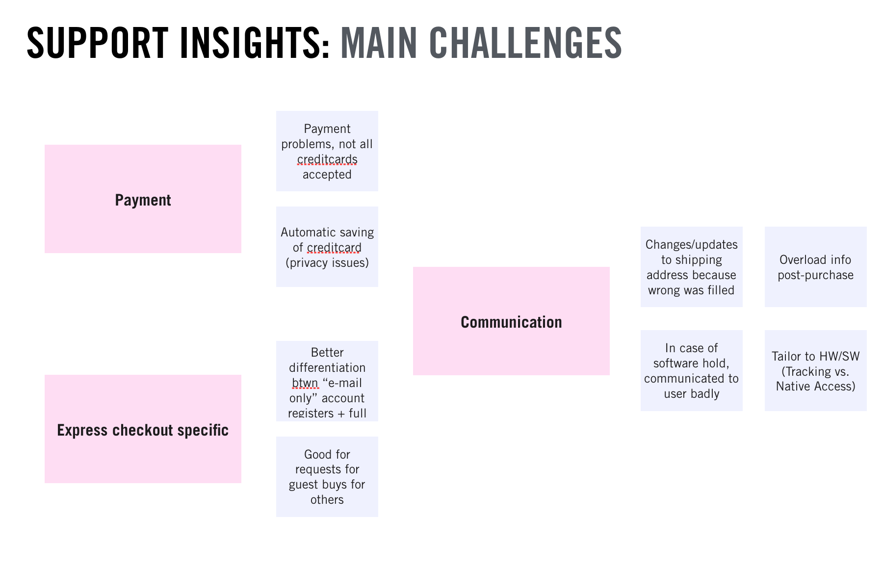
Interview support stakeholders
Online Marketing Insights
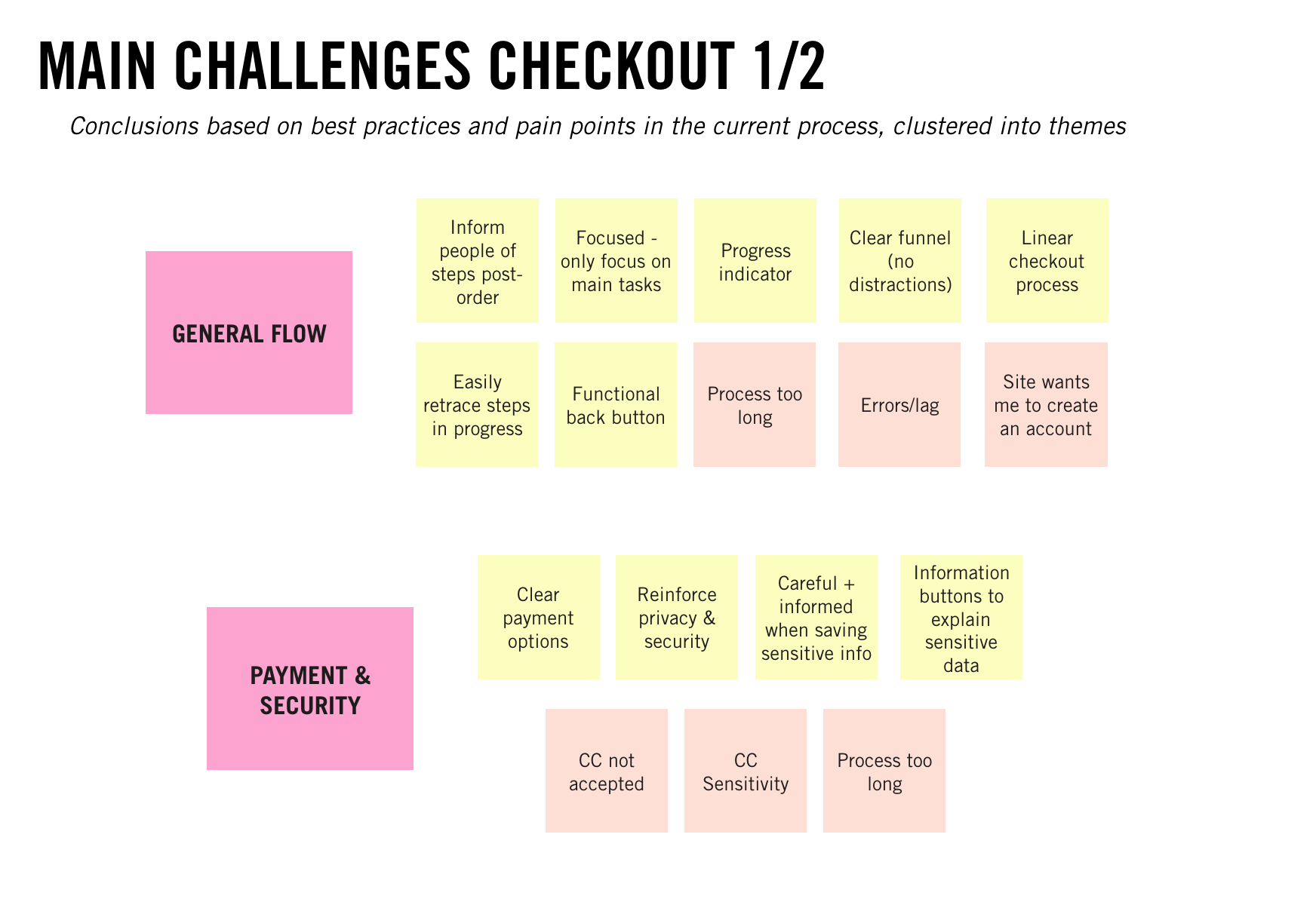
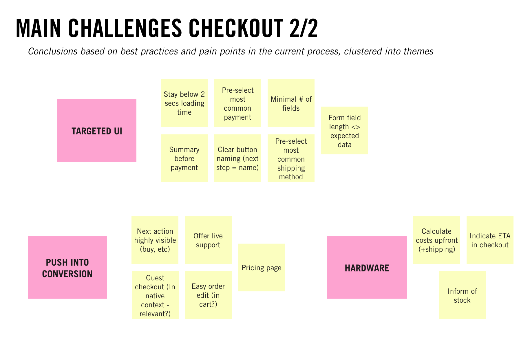
Best practices
Aspirational scenario
Map out aspirational user flow
Wireframe first outline
Working prototype in InVision
Testing
Test click prototype with users
Design iteration
Final concept
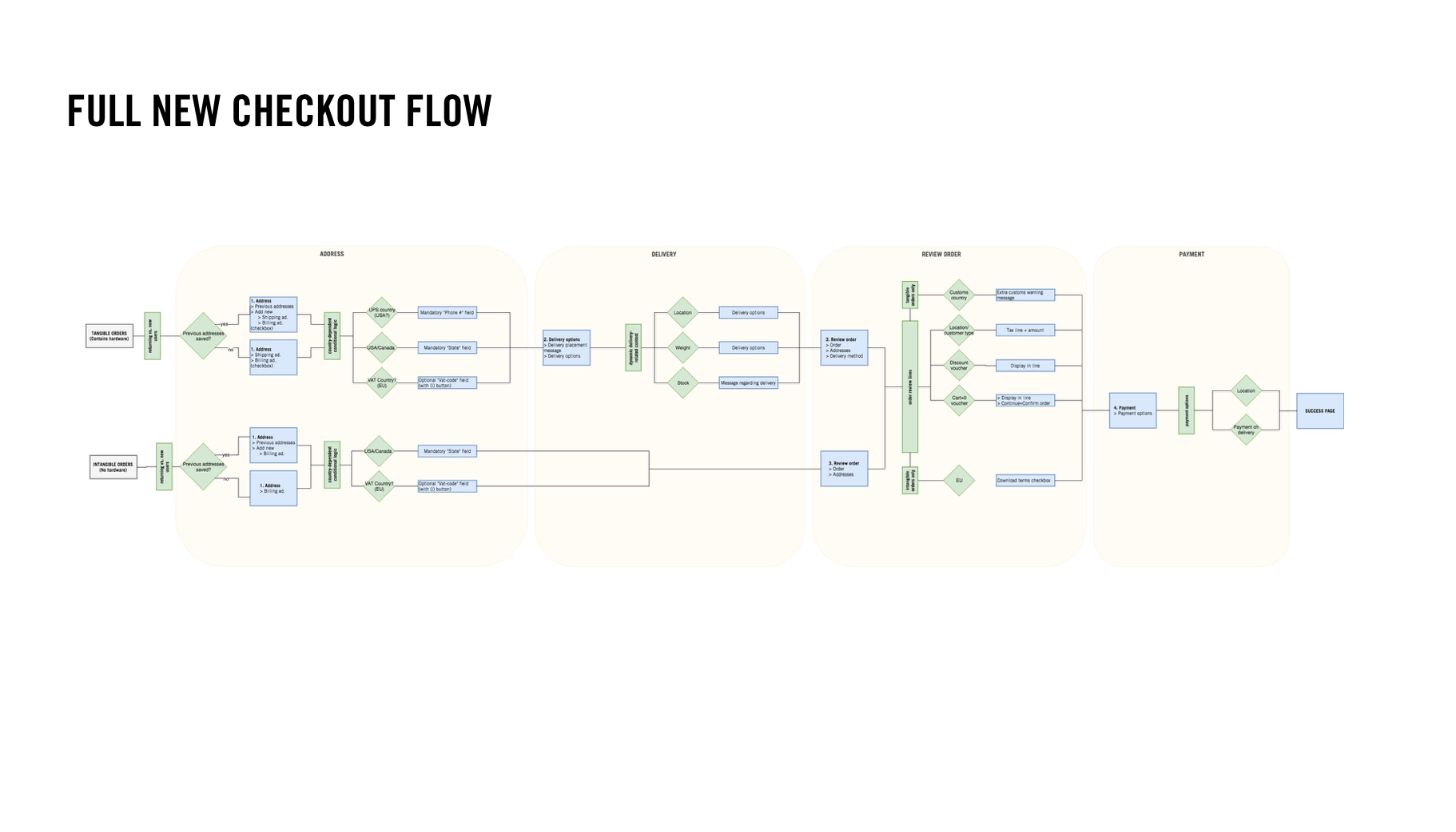
Full user flow
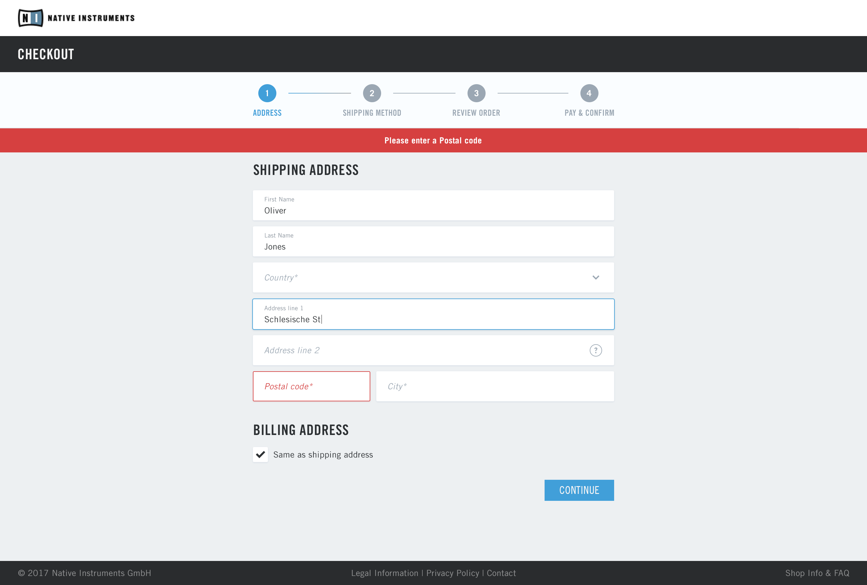
Use case detailing - scenarios/logic/error messaging
UI Design
Front-end development
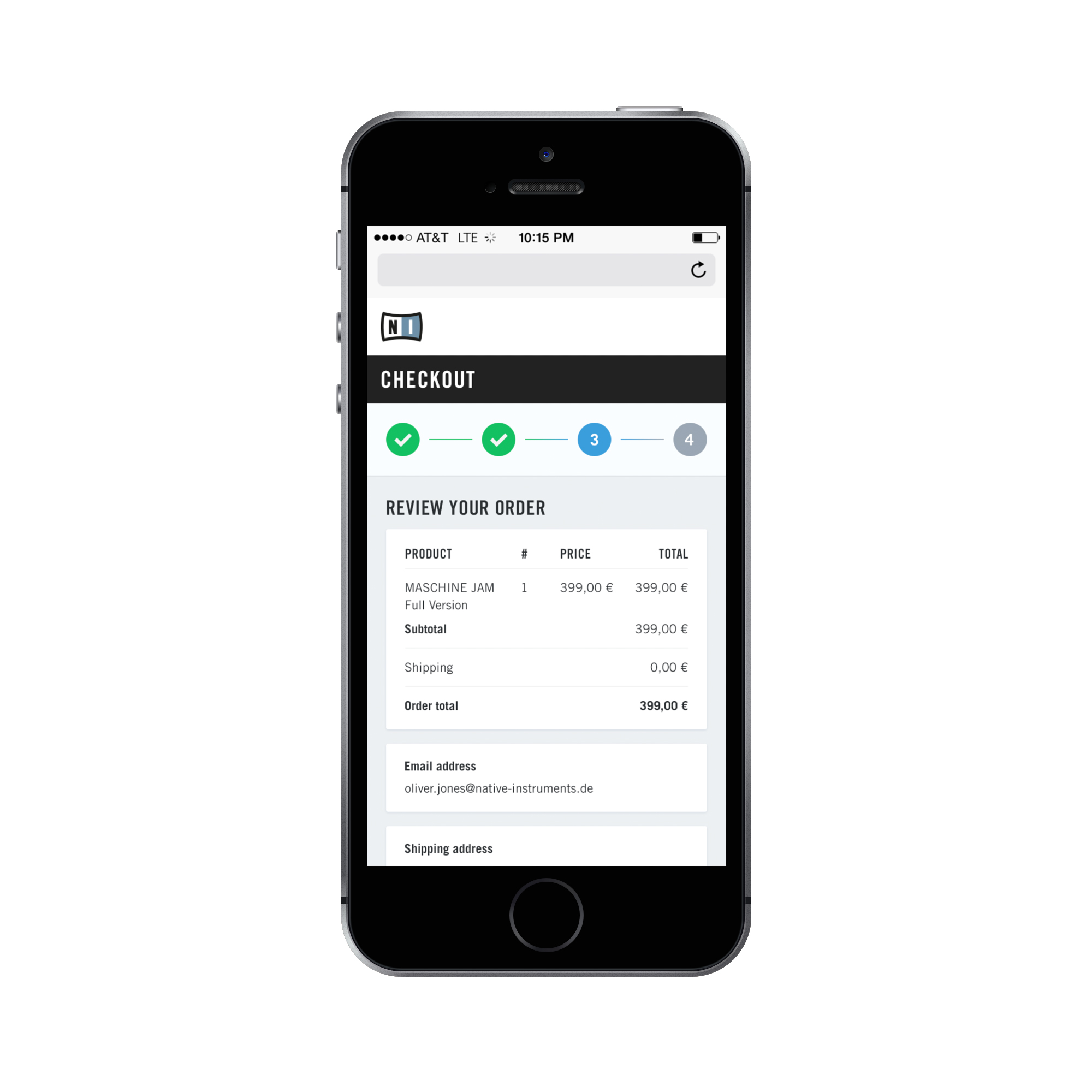
Mobile responsive use cases
Limitations: limited implementation time, development power and technical debt. Little room for UI renewal or working with new branding elements.
Some snapshots of process deliverables
Final design